Showing posts with label css. Show all posts

Tuesday, September 1, 2015

A web developer's stake in the Battle of the frontends

It use to be easy as pie being a frontend dev or engineer. You either roll your own frontend framework that doesn't use tables for layouts or pick something with a grid like 960.gs and you're good. That was like 4-5 years ago. Now there's a long list of front-end frameworks to choose and all of them have fanboys. It's a mess.

For me, there are four choices that really make sense. It makes sense because I've used them in one form or another. Also, all these frameworks are responsive by default so they support mobile development also not just standard web.

  • Material Design Lite - If your going Google then this is framework for you. The thing with this is that it doesn't rely on any JavaScript. This is the "truest" implementation of Material Design if you're making the argument for say, Material Bootstrap.
  • MetroUI (and Office-UI-Fabric) - This is for those who like tiles (MetroUI). Fabric for web apps that look like Office365 apps. You don't have to be knee deep in building Window apps for web and phone to be using this - ie. You don't need Visual Studio or have a pricey WinDev account. It's open-sourced - Surprise! Surprise! It's built using Less; Curious though, no Typescript.
  • Foundation by Zurb - Foundation is staple for those rabid SaSS fans and unlike the first two, this framework comes with everything even the kitchen sink. Heck, you can even make your own plugins. The strength of Foundation is its more malleable than Material or Metro but that's offset by the fact it's also has more moving parts. Testing much?
  • Bootstrap - Twitter Bootstrap, the preferred frontend framework for the design impaired developer. Popular (maybe) and easy-to-use (arguable) it's  not bad looking even if you're just using the base CSS. Sure, you can customize it with your choice of SaSS or Less but if your in a hackathon you just don't care and use a theme from one of many websites making free bootstrap themes like this one
For us web devs, we treat these 4 frameworks as the same thing, 4 different libraries that do the same thing. But we won't tell the UX guys that, they'd go ape shit.

Monday, January 26, 2015

Dropping Bootstrap for Patternfly

Bootstrap is a godsend to single developers who suck at design. It had everything from components to simple animations for that eye candy.

And then things messy when that developer finds "themes" for bootstrap like the free ones over that bootswatch or the high-end stuff over at wrapbootstrap. I'm not saying these things are bad but all to often developers don't have the "design disciple" to use these themes. As developers, we have this tendency to use all the features, colors, suggested layout, etc.; user experience not withstanding. I'm guilty of this. We end up with this "soup" of a website or web app that's full of fancy animations and inconsistent visual design.

I think the fix for this is a set of guidelines that developers can happily follow and this is where patternfly comes in. Pattenfly is built on bootstrap so developers already using bootstrap will have no problem using it.

The nice things with Patternfly:

  1. No more trawling the net for lay-outing advice (https://www.patternfly.org/wikis/layout-templates/)
  2. Common design patterns done (https://www.patternfly.org/wikis/patterns/loginlogout/)
  3. Shitload of widgets, visual widgets and fonts
  4. And it's free; github here.


Sunday, August 18, 2013

Bootstrap tabs and the curious case of the missing bottom border

I'm a big fan of Twitter bootstrap. It's a big help for the design impaired. But as helpful Bootstrap is it still has a few things that you have to do yourself. It is where my story begins. I needed to get to here:

Tabs pulled right with an H4 element on the left WITH a bottom border


From here. This is how it should look like with the default markup using Bootstrap.

Tabs pulled right with an H4 element on the left WITHOUT a bottom border

I will post the markup here. The HTML markup is pretty standard.

     <div class="col-8 subheader">  
       <h4 class="pull-left">Postings</h4>  
       <ul class="nav nav-tabs pull-right" id="myTab">  
         <li><a href="#interesting" data-toggle="tab">Interesting</a></li>  
         <li><a href="#freshest" data-toggle="tab">Freshest</a></li>  
         <li><a href="#popular" data-toggle="tab">Popular</a></li>  
       </ul>   
     </div> 

The interesting part is getting the bottom border to work out. If all goes to plan it should stretch from the "Postings" element up to the first tab. My solution isn't that good if you're into strict semantic HTML5 but I'd rather get it working than worrying about writing proper semantic HTML5. At least it will validate.
     
     <div class="col-8 subheader">  
       <div id="btm-border"></div>
       <h4 class="pull-left">Postings</h4>  
       <ul class="nav nav-tabs pull-right" id="myTab">  
         <li><a href="#interesting" data-toggle="tab">Interesting</a></li>  
         <li><a href="#freshest" data-toggle="tab">Freshest</a></li>  
         <li><a href="#popular" data-toggle="tab">Popular</a></li>  
       </ul>   
     </div> 

The other half is the CSS rule. I write CSS using Less. Why? BECAUSE REASONS!

.subheader{
    position: relative;

    #btm-border{
        border-bottom: 1px solid #ddd;
        position: absolute;
        width: 446px;
        top: 42px;
    }
}

Monday, April 23, 2012

My website starterkit - 1kb Grid, Less, Formalize & Reset

I made starter kit for web development. It's a simple 960 grid-based kit with Less CSS. My starter kit is based on Tyler Tates' 1KB CSS grid, but it also has other stylesheets like:
  1. Meyer's Reset - to reset everything
  2. Formalize - for well mannered forms. 
  3. Style.less - This is where you should be adding your CSS, in the Less format.
I also turned Formalize and Grid into Less style sheets so I can combine all three into a single style sheet.

The starter kit also has jquery1.7 (via CDN) already added. You might want to change this during development.

To get the most of my starter kit you'll need something to turn Less style sheets to valid cascading style sheets. Try out Winless or Simpless.

You can clone my mercurial repo at https://bitbucket.org/jaypax/grid10kless if you want to try it out.

In case your wondering the code is DBAD licensed.

Tuesday, November 29, 2011

Centering an inner div vertically inside another div

Green div is centered on a gray div
So how do you:
A div tagged as "divsmall" is contained inside a bigger div tagged as "divbig". the challenge is how to *vertically* align/center divsmall inside divbig.
Interesting question although having limited applications but still this should be possible. So, broke out my favorite IDE and started coding away. We start with our HTML.

 <!DOCTYPE html>  
 <html>  
   <head>  
     <meta http-equiv="Content-Type" content="text/html; charset=UTF-8">  
     <link rel="stylesheet" type="text/css" href="css/mystyle.css"/>  
     <title></title>  
   </head>  
   <body>  
     <div class="div-big">  
       <div class="div-small">  
         <strong>div-small</strong>  
       </div>  
     </div>  
   </body>  
 </html>  
This should be easy to read. We then move to the CSS.

.div-big{
    background: #999;
    border: 1px solid #000;
    min-height: 640px;
    margin: auto;
    text-align: center;
    width: 940px;
}

.div-small{
    background: #66cc00;
    border: 1px solid #666;
    min-height: 600px;
    margin: 20px auto;
    width: 25%;
}
The trick in the margins. If you look at line 14, that all you need to center inner div. The width doesn't really matter. Try modifying the width value at line 15. The div should adjust in relation to its parent div.

Sunday, January 24, 2010

Getting that layout just right

Getting that layout just right or more like changing the layout into something else I like. That's right, changing the look of our web application. Now, since this is tutorial - we are not going to reinvent the wheel. So, no wires, drafts, sketches or whatever remotely artistic. We go the cowards way and look for a cop out. So drop that pad and pen (or pencil) and open you're browser and point it to freecsstemplates.org or oswd.org. We are going to pick one out and use it. so browse, pick and download a design.


For me I am using a fixed-width design with two-columns from freecsstemplates.org. Its called Republic.

Now, you should be able to read html and some css for this part. When you have figured out how the republic template works, you know its time to use it and replace ours.

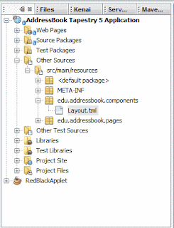
So, we open up Tapestry's Layout component. Almost everything in Tapestry is a component. The Layout component comes in two parts - the Layout.tml (just like you see in the pic) and the Layout.java (which is the java class). Layout.java (if haven't figured it out) is in the source packages.

Now we are going to do a simple find and replace for this part, but not everything. For example:

 <div class="post">  
   <div class="title">  
      <h2>${title}</h2>  
   </div>  
    <div class="entry">  
      <t:body/>  
    </div>  
 </div>  

If you see tags like a ${title} and the <t:body/>, you should be aware that these are page variables that Tapestry will replace. So you will have to work around them to get the look you want. It should be fairly clear that anything with a "$" or "t:" prefix is connected to something in our Tapestry application.

That should be easy.

After recoding the html, now you need to replace the css. Now within the Web pages there should be a Layout.css file in a (duh) layout folder. Open that and then open (use notepad) layout.css of the republic template. Copy and paste over. Don't forget about the image folder. And BAM! you got a new look.

BTW, you might need to clean the cache of your web browser and/or application server (assuming that you're using something else other than jetty *big grin*)


This is how it should look now after a few minutes of playing around with the HTML and CSS. Don't worry if you don't like it - you could always change how the thing looks quite easily.

Remember, if you want to get your grubby hands on the code you need to learn how to use SVN. Again, this tutorial project is hosted by kenai.com at this URL: http://kenai.com/projects/addressbook-tap.

Hoots!